In a new interview with Oran O’Beirne of Overdrive.ie (transcribed by Blabbermouth), Sepultura frontman Derrick Green spoke about his plans for after the band’s ongoing farewell tour. He said: “Well, I still wanna be involved in music. I would definitely love to create another band. And so I’m working on that, putting people together, getting together with people and seeing how that goes.”
Asked about a possible musical direction for his post-Sepultura project, Green said: “What I’m feeling is I definitely would love it to be as heavy, but at the same time a lot more melodical, a bigger mixture of singing and screaming. That’s the vibe that I’m feeling. And very much groove oriented. It’s what I have in my head.
“But it all depends on the combination of people that come together to create this idea. But I’ve already started talking to people and trying to figure out what could work best.
“’Cause I’m very excited with the music scene that’s happening. I live in [Los Angeles], so there’s a lot of bands passing through, and I had the chance to check out a lot of things that I never knew about or bands I’d never heard about.
“And it’s an exciting time, especially for hardcore and me being a hardcore kid, growing up in that scene, it’s great to see how it’s expanded and how big it’s become and still having so many different bands with their own personality and that stick out and are just super impressive and very energetic, and such a diverse scene of people. It’s great to see that mixture, because it wasn’t always there.”
Green also addressed the non-music pursuits he plans to explore once the farewell run concludes: “I always felt that I wanted to do voiceover work, whether it be for animation or commercial work, so that’s something that I’m gonna be pushing for, 100%.
“And also with food and the plant-based world, definitely working as far as whatever cool ideas that come about. I love to be a part of any type of project, and it’s great working with [former Whitesnake and current Bruce Dickinson bassist] Tanya O’Callaghan. Hopefully we can do more with [the plant-based travel and lifestyle web/TV series] ‘Highway To Health’, was the name of our program that we have. We have a lot of material that was never shown. It still needs to be edited. So hopefully we’ll be able to do more with that.
“So there’s a lot of options at the end of this. And so just trying to put it together in my head, but at the same time, stay focused with the many shows that we have in front of us.”
Sepultura’s final show will take place on November 7, 2026, at the Mercado Livre Arena Pacaembu in São Paulo, Brazil. Also on the bill: Metal Allegiance, featuring Mike Portnoy (Dream Theater), Alex Skolnick and Chuck Billy (Testament), Phil Demmel (ex-Machine Head), Troy Sanders (Mastodon) and bassist-founder Mark Menghi; Krisiun; and Sacred Reich. Former members including Jean Dolabella and founding guitarist Jairo Guedz — who preceded Kisser in the lineup — are also expected to appear.
Sepultura most recently released the EP The Cloud Of Unknowing via Nuclear Blast and is recording 40 songs in 40 different cities for a live album commemorating the farewell run. The tour launched on March 1, 2024 at Arena Hall in Belo Horizonte, Brazil — marking the debut of drummer Greyson Nekrutman (ex-Suicidal Tendencies), who stepped in after Eloy Casagrande departed to join Slipknot.
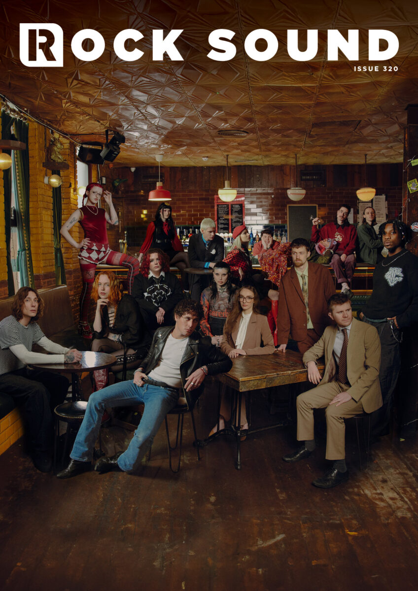
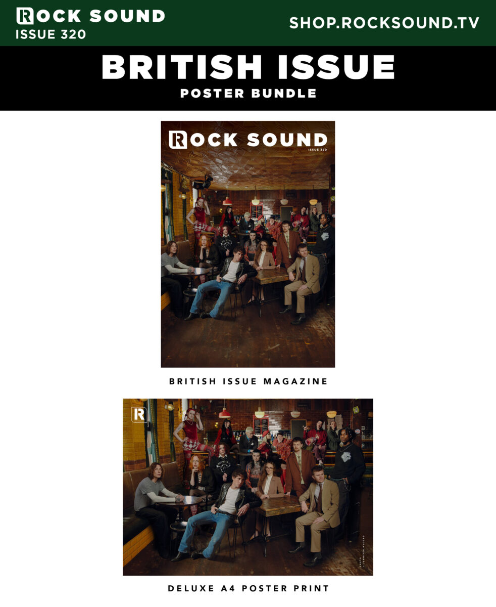
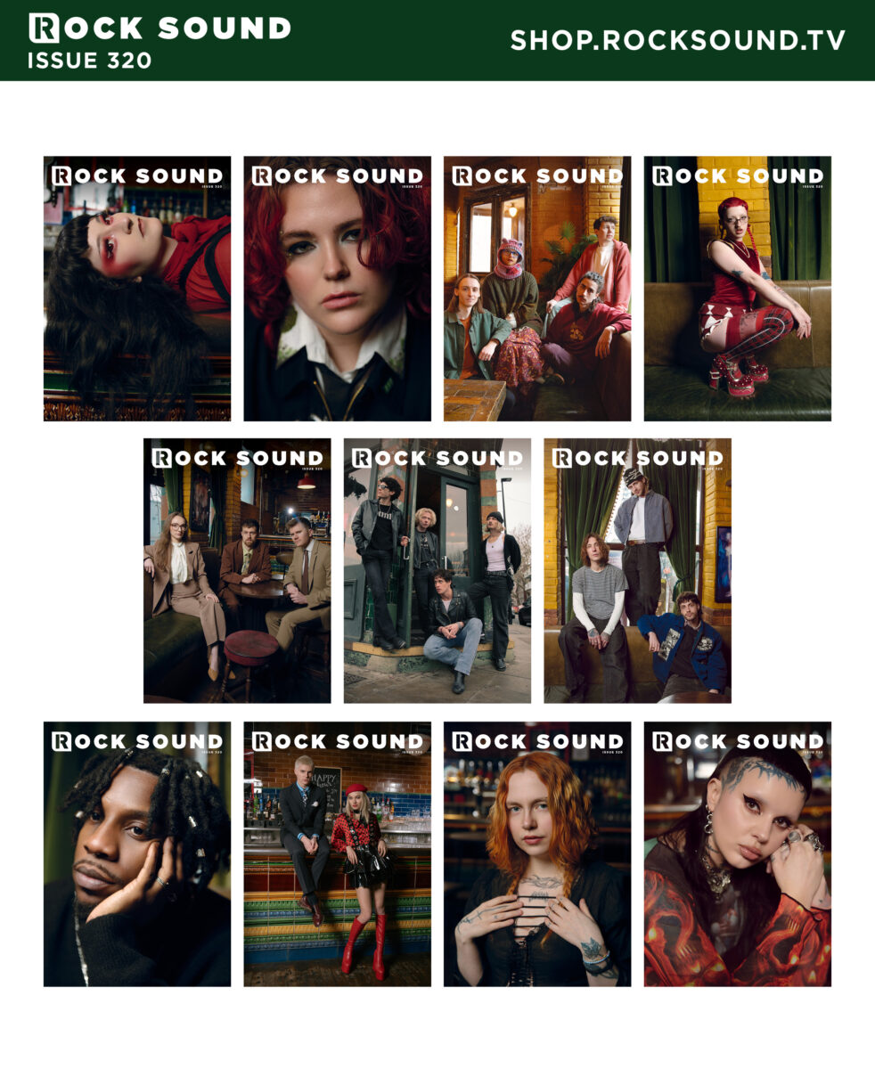
For our second annual all-British issue, we have assembled 11 of the UK’s most exciting rising stars for a special group photoshoot and interview, this time at the legendary Camden Barfly venue.
It’s time for you to get to know…
THE MOLOTOVS NATIVE JAMES AS EVERYTHING UNFOLDS BEARS IN TREES ZAND MOUTH CULTURE WITCH FEVER ARTIO CODY FROST LEAP EXPLORING BIRDSONG
…as we celebrate the best of new British alternative music.
wie angekündigt könnt ihr seit heute, 03. August 2026, 18.00 Uhr euer übrig gebliebenes Cashless Payment Guthaben über unser Eventportal zur Auszahlung anfordern. Das Guthaben wird innerhalb von 14 Tagen nach Beantragung gutgeschrieben.
Black Ink and Dark Pages: The Visual History of Gothic Typography
A page opens beneath candlelight. Dense black letters fill the parchment, their sharp angles rising like cathedral spires. At first glance, the text appears beautiful. A second look reveals something more unsettling. The letters seem almost architectural, crowded together like stone towers casting long shadows across the page.
Few visual styles possess the enduring power of Gothic typography. For more than eight centuries, Blackletter fonts have been associated with mystery, authority, religion, horror, and the darker corners of imagination. They appear on medieval manuscripts, heavy metal albums, Gothic novels, tattoos, and modern digital artwork. Despite dramatic changes in technology and design, their emotional impact remains remarkably consistent.
The reason goes beyond nostalgia. Gothic typography communicates ideas before a reader processes a single word. Its dense forms, sharp lines, and dramatic contrasts create an atmosphere that feels ancient, serious, and slightly unsettling. The letters themselves become part of the story.
This is why Gothic typography has survived long after many historical design styles disappeared. It transforms language into architecture, turning ordinary text into a visual experience shaped by beauty, mystery, and shadow.
Gothic typography transforms writing into a visual language of mystery, history, and atmosphere.
From Monasteries to Printing Presses
The story of Gothic typography begins in medieval Europe. During the twelfth century, scribes working in monasteries and religious centers developed increasingly compact styles of writing. Parchment was expensive, and manuscripts required enormous amounts of labor. Dense letterforms allowed more text to fit onto a page while maintaining legibility.
Over time, these writing styles evolved into what modern designers call Blackletter. The letters became narrow, angular, and vertically oriented. Curves were reduced. Straight lines dominated. The resulting appearance felt structured and monumental.
Far from being purely decorative, the style reflected the visual culture of the era. Gothic cathedrals were rising across Europe, filling city skylines with pointed arches, stained glass, and soaring vertical forms. Typography absorbed many of the same aesthetic principles.
Letters no longer resembled casual handwriting. They resembled architecture.
The Gutenberg Revolution
The invention of movable type transformed Gothic typography from a regional manuscript tradition into a dominant visual language. When Johannes Gutenberg printed his famous Bible in the 1450s, he chose a Blackletter style closely resembling the handwritten manuscripts readers already trusted.
This decision was practical, but it also carried symbolic importance. The printed page preserved the authority and gravitas associated with religious texts. Readers encountered a new technology through a familiar visual form.
As printing spread across Europe, Blackletter became one of the most recognizable typographic styles in the world. For centuries, it represented knowledge, tradition, and institutional power.
Yet the same qualities that communicated authority also created an atmosphere of mystery. The dense arrangement of letters, heavy use of black ink, and elaborate forms gave Gothic typography a visual weight that simpler typefaces could not replicate.
Why Gothic Letters Feel Dark
Most people recognize Gothic typography instantly, even if they cannot identify specific fonts such as Textura or Fraktur. The emotional response occurs almost automatically. The letters appear dramatic, historical, and slightly ominous.
Part of this reaction comes from density. Gothic typefaces place letters close together, creating dark blocks of text rather than open fields of white space. The page feels heavier. Shadows seem to accumulate between characters.
Verticality also plays an important role. Many Blackletter fonts emphasize upward movement through tall strokes and pointed forms. The effect resembles Gothic cathedrals reaching toward the sky. Readers unconsciously associate these shapes with age, grandeur, and spiritual intensity.
Even the sharp angles contribute to the atmosphere. Rounded forms often appear friendly and approachable. Angular forms suggest tension, precision, and seriousness. Gothic typography uses these visual cues to create emotional impact before the text itself has been read.
The darkness is not contained within the words. It emerges from the letters themselves.
The Psychology of Gothic Letterforms
Typography influences perception long before readers consciously process language. Designers understand that shapes carry emotional associations. Rounded forms often appear welcoming. Geometric forms suggest efficiency. Handwritten scripts can feel personal or elegant.
Gothic typography operates according to a different set of visual signals. Its compressed structures, pointed angles, and dense arrangements create an immediate impression of seriousness and complexity. The letters seem to belong to another era.
This reaction occurs partly because Blackletter differs dramatically from the clean, open typefaces that dominate modern life. Most people spend their days reading sans-serif fonts on screens, signs, and digital interfaces. When confronted with Gothic typography, they encounter something visually unfamiliar.
The unfamiliar naturally attracts attention. It slows reading and encourages closer examination. The text feels less like information and more like an artifact.
The Uncanny Page
Psychologists often describe the uncanny as the sensation of encountering something that feels both familiar and strange at the same time. Gothic typography frequently produces this effect.
Readers recognize the letters as part of the alphabet, yet the forms appear transformed. Words remain readable, but their visual presentation feels distant from ordinary experience. The page occupies an unusual space between communication and ornament.
This tension contributes significantly to Gothic typography’s enduring appeal. The letters belong to the modern world while simultaneously appearing to emerge from a forgotten past. They feel alive with history.
A Gothic page often resembles a relic rather than a simple document.
Why Blackletter Commands Authority
For centuries, Blackletter appeared in religious texts, legal documents, royal decrees, and scholarly publications. Readers repeatedly encountered the style in contexts associated with power and knowledge. Over time, the visual language absorbed those associations.
Even today, Gothic typography often communicates authority before a single sentence has been read. The style feels formal, ceremonial, and important. Designers continue using it when they want to suggest tradition, heritage, or historical significance.
This authority stems partly from complexity. Blackletter requires more effort to read than many modern fonts. The visual density encourages concentration. Readers instinctively slow down and pay attention.
The result is a typeface that feels substantial. It demands engagement rather than passive consumption.
Mystery Through Design
Authority alone does not explain Gothic typography’s connection to horror, dark fantasy, and Gothic culture. Another factor is mystery.
The visual density of Blackletter creates subtle ambiguity. Individual letters sometimes appear interconnected. Shadows form between strokes. Decorative details reward careful observation. The page reveals itself gradually rather than immediately.
This mirrors many of the themes found within Gothic literature itself. Secrets remain hidden. Meanings unfold slowly. The reader moves through uncertainty toward understanding.
Typography becomes part of the narrative atmosphere. Before the story begins, the visual presentation has already established expectations.
Edgar Allan Poe and the Gothic Printed Page
Although Edgar Allan Poe rarely discussed typography directly, publishers quickly recognized that Gothic letterforms complemented the atmosphere of his work. Across generations, editions of Poe’s stories and poems have frequently employed Blackletter titles, ornate Victorian layouts, and dark decorative elements.
The connection feels natural. Poe’s fiction explores hidden fears, psychological uncertainty, decaying spaces, and the tension between beauty and death. Gothic typography communicates many of these ideas visually before readers encounter the first paragraph.
A modern edition of The Raven printed in a minimalist sans-serif font creates one impression. The same title presented in dramatic Gothic lettering creates another entirely. The words remain unchanged, yet the emotional experience shifts immediately.
Typography functions as a threshold between the reader and the text. Gothic letterforms prepare the imagination for mystery.
When Typography Becomes Storytelling
The most successful book design does more than package content. It extends the themes of the work itself. Gothic typography excels at this because its visual qualities align naturally with many Gothic narratives.
Consider a typical Gothic novel. Ancient architecture, hidden histories, family secrets, and psychological tension frequently appear throughout the story. Blackletter evokes many of these ideas through shape alone. The letters seem weathered by time. They suggest forgotten archives and candlelit libraries.
Readers may not consciously analyze these visual cues, yet they influence interpretation nonetheless. The typography becomes part of the storytelling process.
Long before a haunted house appears on the page, the atmosphere has already begun forming in the reader’s mind.
From Medieval Manuscripts to Modern Subcultures
Gothic typography survived centuries of technological change because it continually adapted to new cultural movements. While many historical typefaces remained confined to museums and archives, Blackletter found new audiences in music, fashion, literature, and visual art.
During the twentieth century, the style became closely associated with alternative culture. Heavy metal bands adopted Gothic lettering for album covers, logos, and merchandise. Horror publishers used it to create atmosphere before readers opened a book. Fantasy artists employed Blackletter to suggest ancient kingdoms, forgotten histories, and supernatural worlds.
The appeal remained remarkably consistent. Gothic typography communicated seriousness, mystery, and emotional intensity. It transformed ordinary titles into visual statements.
Whether appearing on a medieval manuscript or a modern album cover, the letters continued performing the same essential function. They made language feel larger than everyday life.
Horror, Music, and the Language of Darkness
Few visual styles have influenced dark culture as profoundly as Blackletter. Horror films frequently employ Gothic typography in posters, title sequences, and promotional artwork because the style immediately establishes mood.
Musicians discovered the same advantage. Gothic rock, black metal, dark folk, and numerous alternative genres embraced Gothic lettering as a visual extension of their artistic identity. The typography became part of the atmosphere surrounding the music.
A simple title rendered in Gothic lettering feels different from the same words presented in a modern corporate font. One suggests mystery and history. The other suggests efficiency and clarity.
The emotional difference is immediate.
Why Gothic Typography Survived the Digital Age
The arrival of computers transformed nearly every aspect of typography. Designers gained access to thousands of fonts while digital interfaces encouraged cleaner, more minimalist approaches to communication.
Many observers assumed highly decorative styles would gradually disappear. Gothic typography proved surprisingly resilient.
One reason is contrast. As digital design became increasingly streamlined, Blackletter became even more visually distinctive. Its complexity stood out against the simplicity of modern interfaces.
Another reason involves emotion. Minimalist fonts excel at delivering information efficiently. Gothic typography excels at creating atmosphere. The two styles serve different purposes.
Whenever designers want to evoke history, mystery, spirituality, horror, or dramatic intensity, Blackletter remains one of the most effective visual tools available.
More Than a Font
The survival of Gothic typography reveals an important truth about design. People do not respond only to information. They respond to feeling.
A typeface can communicate emotional meaning before the reader consciously processes language. Gothic lettering demonstrates this principle with unusual clarity. The forms themselves generate atmosphere.
This ability explains why the style continues appearing across media that have little direct connection to medieval Europe. Modern audiences may know nothing about monastic manuscripts or Gothic cathedrals, yet they still recognize the emotional language encoded within the letters.
The visual vocabulary remains surprisingly universal.
Why Gothic Letters Still Feel Powerful
After more than eight centuries, Gothic typography continues captivating readers because it accomplishes something rare. It transforms writing into an experience.
The dense black forms evoke history. The vertical structures suggest architecture. The sharp angles create tension. Together, these elements produce a visual language capable of communicating mystery before a single word has been read.
Few design traditions maintain such emotional power across radically different eras. Blackletter has survived manuscripts, printing presses, industrialization, photography, cinema, and the digital revolution. Through every transformation, it retained its ability to command attention.
The reason is simple. Gothic typography speaks to something deeper than fashion. It appeals to humanity’s fascination with history, symbolism, and the unknown.
Readers encounter more than letters on a page.
They encounter atmosphere.
The Architecture of Language
From medieval monasteries and Gutenberg’s printing press to Edgar Allan Poe editions and contemporary Gothic culture, Blackletter has remained one of the most recognizable visual styles ever created.
Its endurance comes from more than tradition. Gothic typography transforms language into architecture. Every page becomes a space readers enter rather than simply observe.
The letters rise like cathedral spires. Shadows gather between strokes. Meaning unfolds through both text and design.
That combination of beauty, mystery, and visual drama explains why Gothic typography continues inspiring artists, writers, musicians, and readers around the world.
The words tell the story.
The letters create the mood.
Wear the Darkness
If Gothic literature, Edgar Allan Poe, dark aesthetics, and the visual language of mystery inspire you, explore the Edgar Allan Poets store. Discover apparel and artwork created for lovers of darkness, imagination, and timeless Gothic culture.
Join the Noir Newsletter
Receive Gothic literature, dark history, visual culture, Edgar Allan Poe analysis, and noir psychology directly in your inbox.
Enter the Atmosphere
Continue your journey through Gothic culture, dark aesthetics, and literary mystery with the official Edgar Allan Poets playlist.
Frequently Asked Questions
What is Gothic typography?
Gothic typography, often called Blackletter, is a style of writing and type design that emerged in medieval Europe and is characterized by dense, angular, highly decorative letterforms.
Why is Blackletter associated with Gothic culture?
Its visual density, historical associations, and dramatic appearance naturally complement themes of mystery, darkness, history, and atmosphere found within Gothic culture.
Did Edgar Allan Poe use Gothic typography?
Poe did not specifically write in Gothic typefaces, but publishers have frequently used Blackletter and Victorian-inspired typography for editions of his works because the style complements their themes.
Why do Gothic fonts feel dark?
Dense letter spacing, strong vertical structures, sharp angles, and heavy black forms create visual weight and psychological associations with mystery, history, and seriousness.
Is Gothic typography still used today?
Yes. Blackletter remains popular in music, fashion, publishing, gaming, branding, and alternative culture because of its powerful visual identity.
(written by Islander) As you can see, the cover art created by Brvja XIII for Demonic Manifestation’s new album Grimshrine is a cornucopia of horrors. It seizes attention and maintains it as the viewer more carefully inspects each of its hideous visions. The album is also a musical cornucopia of horrors that turns out to […]
Dutch collective TRENCHWAR unveil “Overlords of Cold”, the second single and title track from their forthcoming debut album, scheduled for release on September 18th, 2026 via Time To Kill Records. Offering a deeper glimpse into the band’s creative vision, “Overlords of Cold” is built around monolithic riffs and an ever-present sense of impending collapse. Drawing on the members’ extensive backgrounds within the Dutch […]
Swedish death metal band Cryptorium are back with a new album that’s better than their previous one in almost every way. The guys have meticulously worked on the songwriting, sound, and even aesthetics to deliver an album that can be deemed worthy of being a successor to the legendary ones in the style and have topped it up with their own kind […]
If you attended the Zac Brown Band show last night, you might be seeing your fellow concertgoers again. You could literally end up on the same boat. Right before performing his 2021 hit “Same Boat,” Zac Brown announced a massive surprise for the crowd.
This is the third album from US black metal band Hulder. Following on from 2022’s The Eternal Fanfare and 2024’s Verses in Oath, comes the 49-minute Verbolgen, which is Hulder’s first as a duo. Verbolgen is old-school black metal, delivered with contemporary skill and vision. If you’re familiar with Hulder’s past work, then this new record is the … Continue reading “Hulder – Verbolgen (Review)”
Disclaimer: I received this product in exchange for my honest review. The Metalverse is an independent website, and all opinions expressed are our own. We thank the team at Baseus for giving us this opportunity. This article is not sponsored, and we have no incentive/kickback from the company/
VST Review Table
Baseus Bowie MC2
8.5
The Metalverse Score
Pros
Very Secure and Comfortable
Good sound quality while allowing you to hear your surroundings
Multipoint BT
Long battery life
Cons
Sound quality won't match closed ear buds
Price
$60
Baseus has a limited time discount code "MC2OWSPR" to get the MC2 for $49.99
Baseus has built its reputation on affordable, well-designed tech accessories, chargers, cables, power banks, and increasingly, audio gear that doesn't feel like an afterthought. The Bowie line is where the company has put its most serious audio engineering, and the MC2 is the latest attempt to prove that clip-on, open-ear earbuds don't have to cost Bose or Shokz money to sound and feel premium.
What Is the Baseus Bowie MC2?
The Bowie MC2 is an open-ear, clip-on true wireless earbud, meaning it rests just outside your ear canal instead of plugging into it. It's the successor to the Bowie MC1 Pro, and it's built around 11mm tri-magnet dynamic drivers, LDAC Hi-Res audio support, Bluetooth 6.0 with multipoint, and Baseus's SuperBass 3.0 tuning. It launched in June 2026 at an MSRP of $89.99, though it's frequently found discounted closer to $60, (and you can use the limited-time code "MC2OWSPR" to get it for $49.99), putting its cost well below open-ear rivals like the Shokz OpenDots One and Bose Ultra Open Earbuds.
If you've been curious about open-ear earbuds but didn't want to gamble a premium price tag to try the format, this is a good choice.
Build Quality and Design
The MC2 uses a memory titanium alloy C-ring that flexes to the shape of your ear, paired with detachable CloudComfort 2.0 silicone air cushions in three sizes: M, L, and XL. That combination lets you actually tune the fit instead of hoping the stock shape works for your ear, which is a smart move in a category where fit varies wildly from person to person.
Each earbud weighs about 5.1 grams, and the charging case has an oval shape that's more pocketable than a lot of the competition, even if it's a touch slippery to fish out of a pocket. Baseus swapped touch controls for physical buttons on each bud, a decision that pays off in daily use since there's no risk of pausing your music by adjusting your glasses or brushing your hair. It takes a day or two to learn exactly where the button sits by feel, but once you do, it's one of the more reliable control schemes in this price range.
The IP67 waterproof and dustproof rating is a standout for a clip-on earbud. That rating covers the earbuds surviving submersion in up to a meter of water for 30 minutes, well beyond the sweat-and-drizzle protection most open-ear buds offer. Just know the rating applies to the buds only, not the charging case.
Sound Quality
Overall Sound: The Bowie MC2 carries a V-shaped signature with a surprising amount of low-end presence for an open-ear design. Open-ear earbuds usually sound thin because they fire sound toward your ear canal rather than sealing it, but SuperBass 3.0 tuning gives the MC2 more punch and body than you'd expect, without turning muddy. It holds together well at moderate to loud listening levels, though it does tighten up and lose some composure if you push the volume to the top of its range. These won't have quite the volume or clarity of audiophile-standard IEMs, but they sound very good while allowing you to hear your surroundings.
Bass: Bass is full-bodied and present rather than the apologetic hint of low-end you get from most open-ear buds. Sub-bass rolls off gently below 80 Hz, which is normal for the format, but the mid-bass hits with real weight, especially with the app's bass boost engaged. It doesn't feel boomy or bloated; it just fills in the low end that open designs typically leave hollow.
Mids: Vocals sit forward and clear in the mix, which makes the MC2 a strong pick for pop, R&B, and anything vocal-heavy. Instrument separation in the midrange is solid for the price, though it's not going to compete with true audiophile-tier IEMs.
Treble: Treble is present without being harsh or sibilant, giving the sound a sense of clarity and air. It doesn't extend as far as pricier open-ear options, but for casual and even critical listening at reasonable volumes, it strikes a good balance.
Timbre, Soundstage, and Imaging: Timbre leans slightly warm and musical rather than clinical, which suits the MC2's target audience of commuters and casual listeners over strict audiophiles. Soundstage benefits from the open-ear design itself, since nothing is sealing sound directly into your ear canal, giving tracks a sense of openness and air that closed-back IEMs can't replicate. Imaging is decent for the price, with instruments generally placed with enough separation to follow a busy mix, though don't expect pinpoint precision here.
Comfort and Awareness
On comfort, the MC2 might be the best in its class. At 5.1 grams per side, there's no ear canal pressure or fatigue, and the flexible C-ring combined with the three cushion sizes means most ear shapes can find a genuinely secure fit. During walks, workouts, and even vigorously shaking my head, these never slipped out of my ears.
There's a small learning curve to seating them correctly the first couple of times, but it becomes second nature quickly.
On the awareness side, this is the entire point of the open-ear format: your ear canal stays completely open, so you hear traffic, conversations, and your environment the whole time you're listening. That's a feature for runners, cyclists, and anyone working from home who wants to stay tuned into the room, but it also means there's no active noise cancellation, and loud outdoor noise or wind will compete with your music. If you need to block out a noisy commute or gym, this isn't the right category for you regardless of which open-ear model you pick.
How It Compares
Vs. Earfun Clip 2: The Earfun Clip 2 sits in a similar budget bracket and is one of the MC2's closest direct rivals. The MC2 pulls ahead on battery life and app polish, and its bass response is noticeably more present. The Clip 2 is a reasonable alternative if you find it on a steep discount, but the overall edge goes to the MC2 for sound and build quality.
Vs. QCY Crossky C50: The Crossky C50 is another budget open-ear option that competes closely on price. It's a fine value pick, but the MC2's IP67 rating, physical buttons, and LDAC support give it a more complete feature set for a similar cost, making it the easier recommendation for most buyers.
Vs. Shokz OpenDots One: This is the aspirational comparison. The OpenDots One costs roughly two to three times as much, and it does hold its composure better at high volumes and in loud outdoor environments. But for the price difference, the MC2 covers the vast majority of what people actually want from open-ear earbuds: comfort, decent bass, long battery life, and a secure fit, without the premium price tag. Unless you specifically need class-leading sound at max volume, the MC2 makes the Shokz price hard to justify.
Final Verdict
The Baseus Bowie MC2 doesn't try to dethrone Bose or Shokz on outright sound quality, and it doesn't need to. What it does is take the open-ear format and make it accessible at a price where trying it out doesn't feel like a gamble. The comfort is genuinely excellent, the battery life is great, the app is clean, and the IP67 rating gives you durability most clip-on buds in this range don't offer. If you've been curious about open-ear listening or just want all-day comfort without spending premium money, the Bowie MC2 is an easy recommendation.