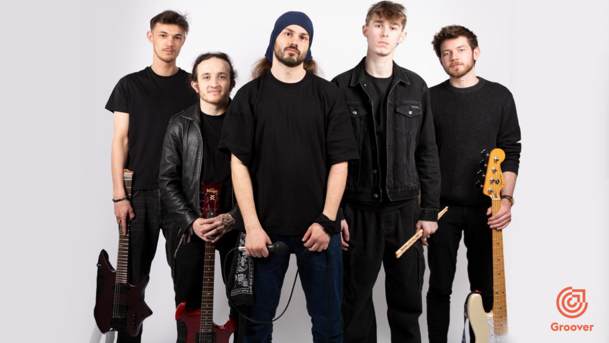
Jamma is a Derby-based nu-metal band built on instinct, energy, and real-time creation. Formed through spontaneous jam sessions, the band focuses on capturing moments as they happen — turning noise into structure and emotion into sound. Blending heavy riffs, groove-driven rhythms, and emotionally charged delivery, Jamma exists between chaos and control. Theirmusic is not driven […]
Symphonic metal star Amanda Somerville has been diagnosed with a “malignant and aggressive brain tumour” her family have revealed.
Somerville is an American singer and vocal coach who made her name working with a string of metal bands including Epica, Avantasia, Kamelot, Trillium, After Forever and others.
Her husband, After Forever guitarist Sander Gommans, says in a statement posted to social media: “I have some very sad news to share.
“The love of my life, mother of my three daughters and my beautiful wife Amanda Somerville, has a malignant and aggressive brain tumour.
“We’re shocked, devastated and I can’t describe the challenges we’re facing as a family right now. We’re very grateful with the help we’re getting from family and friends.
“Positive thoughts help, prayers help, keeping us in your minds help. Please be there for Amanda and our kids and have us in your minds.
“Amanda gives so much to all of us…love, music, friendship, strength….it’s time to send out hope and power to her.”
Somerville has carved out a name for herself with her powerful vocal abilities both as a guest singer and through fronting acts like Trillium and the Kiske/Somerville project which she formed alongside Helloween’s Michael Kiske.
She has also toured with the likes of Ian Gillan and Alice Cooper, while she has also stood in on lead vocals for Epica when Simone Simons took unwell.
Somerville sang on Tobias Sammet’s metal opera Avantasia world tours from 2008 to 2016 and was the brains behind progressive metal project Aina which released the album Days of Rising Doom in 2003.
NILE And CORONER – UNDERWORLD DISSONANCE U.S. TOUR 2027:
Plus Guest Support Syn Absence
Tue, March 2 – Greenville, SC at Radio Room Wed, March 3 – Nashville, TN at The Basement East Fri, March 5 – Dallas, TX at AM/FM Sat, March 6 – Corpus Christi, TX at House of Rock Sun, March 7 – Austin, TX at Come and Take It Live Tue, March 9 – Albuquerque, NM at Sunshine Theater Wed, March 10 – Mesa, AZ at Nile Theater Fri, March 12 – Boise, ID at Shrine Social Club Sat, March 13 – Spokane, WA at Knitting Factory Sun, March 14 – Seattle, WA at El Corazon Mon, March 15 – Portland, OR at Hawthorne Theater Wed, March 17 – Roseville, CA at Goldfield Roseville Thu, March 18 – San Francisco, CA at Great American Music Hall Fri, March 19 – Santa Ana, CA at Observatory Sat, March 20 – Los Angeles, CA at The Whisky Sun, March 21 – San Diego, CA at House of Blues Tue, March 23 – Denver, CO at Oriental Theater Thu, March 25 – Lincoln, NE at Bourbon Theater Fri, March 26 – Des Moines, IA at Wooly’s Sat, March 27 – Milwaukee, WI at The Rave Sun, March 28 – Joliet, IL at The Forge Tue, March 30 – Flint, MI at Machine Shop Wed, March 31 – Lakewood, OH at Mercury Fri, April 2 – Sayreville, NJ at Starland Ballroom Sat, April 3 – New York, NY at Gramercy Theatre Sun, April 4 – Worcester, MA at The Palladium Upstairs Tue, April 6 – Lititz, PA at Mickey’s Black Box Wed, April 7 – Baltimore, MD at Baltimore Soundstage Fri, April 9 – Pittsburgh, PA at Preserving Underground Sat, April 10 – Columbus, OH at The King of Clubs Sun, April 11 – Leesburg, VA at Tally Ho Theater
Hardcore heroes Speed are hosting a huge hardcore Christmas benefit at the new Powerhouse Museum in Sydney.
The band’s annual Christmas show will hit the stage on November 13 with able assistance from Justice for the Damned, It Ends in Tragedy, Time Ends and Paid in Full. The all-ages event will require every ticket holder to brting along one toy or food item to be donated to Project Kindess, and Speed is donating $10K to the Women and Girls Emergency Centre in Redfern.
From helping create jazz rock fusion to tackling everything from funk to Indian music to flamenco, John McLaughlin’s career has been defined by his willingness to take his guitar and his music into undiscovered territory. He looked back with Prog in 2017.
In the late 1960s, change was in the air. Jimi Hendrix had hinted at the possibilities of throwing jazz improvisation into rock music, James Brown amplified the R&B groove to create funk, and Miles Davis and Tony Williams were chomping at the bit to shake off the limits of acoustic jazz.
Originally from Yorkshire, John McLaughlin was a prodigiously gifted guitarist working on the London circuit when Williams brought him to New York to join his new band, Lifetime, for their genre-defying album Emergency!.
Davis, impressed by the young Brit’s speed, fluency and invention, recruited McLaughlin to play on In A Silent Way and Bitches Brew. These three albums tore up the jazz rule book and made something new – jazz rock. It was loud and the critics loathed it; but it was unstoppable.
“It was a great period, the end of the 60s going into the 70s,” says McLaughlin. “I just happened to be in the middle of it all. It was just luck really.”
In 1971 he founded Mahavishnu Orchestra to play their own fearless, ferocious brand of this new form. In the mid-70s, he switched direction to pursue Indian music with Shakti.
Currently leading John McLaughlin And The 4th Dimension, the guitar wizard remains a restless musical explorer, his lightning velocity on the guitar matched only by his boundless drive to expand and improve his craft. “I think music reminds us of our home where we all belong together,” he says. “It’s wonderful.”
What prompted you to record your recent gigs at Ronnie Scott’s in London?
We had two nights there and Ronnie’s has got the facility to record built right into the club, which is really very handy. I asked specifically to play Ronnie’s. It’s very nice to play in the Barbican or the Royal Festival Hall, beautiful halls. Maybe it’s age and nostalgia, but I thought how wonderful it would be to be back in Ronnie’s after how many years. I was in one of the house bands at Ronnie’s in 1966/’67, about 50 years ago, called the Mike Carr Trio: a very fine British Hammond organ player.
A hall can be great, but that intimate communication between the audience and the band – I like that
That was the whole theme in the 60s, the Hammond organ, and of course I have such a huge debt to Ronnie personally. Actually, a lot of musicians have a very big debt to him. You’re probably too young to remember the Wardour Street club before he moved to Frith Street in the early 60s. The first one was a very small club, but when he moved he kept the small one open for the young musicians so we had a place to play. It was very sweet.
Also, he was instrumental in getting me to America in ’68. He was just a super guy and a great player too, so it was personal for me. I asked to record, so maybe we’ll have a Live @ RonnieScott’s. How nice!
How is it different playing in a club versus a big hall?
I like the clubs; I grew up in the clubs. Even when I went to the US playing with Tony Williams and Larry Young, it was all clubs. No concerts at all really until a year later when Jack Bruce joined the band. Jack was already kind of a star in the four-piece Lifetime, but even Miles was playing mainly clubs in America in the 60s and 70s.
There’s an intimate atmosphere in clubs that’s really hard to reproduce in a concert hall. The sound of a hall can be really great, but that intimate communication between the audience and the band, I like that, I really do. They can see the dirt under your fingernails.
You mentioned organ trios were in fashion in the 60s – the original incarnation of Lifetime was an organ trio.
Absolutely. I didn’t even know Larry would be in the band until I got to New York, but I was thrilled. He was one of the new breed of Hammond players that stepped out of the genre of Jimmy Smith, this kind of funky R&B which I loved. But Larry brought this different chordal harmony that McCoy Tyner was doing with John Coltrane in the early 60s. He brought that to the Hammond organ and I thought that was marvellous. On the road, we were making $20 a night in those days. Not a lot, but it was a marvellous experience to play with Tony.
One night in a club Miles Davis said, “It’s time to form your own band.” That was a real shock for me
When you formed Mahavishnu Orchestra, did you consider the organ trio format?
I wanted a different sound. Don’t forget, I’d been playing for many years. We’re talking the early 60s, with people like Georgie Fame And The Blue Flames. I loved it but by the time I’d done two years with Tony and Lifetime with Larry Young, I was breaking out. Plus, I wanted a violin in my band and I always loved the Fender Rhodes.
It must have been the end of 1970 – it’s all Miles’ fault really. One night in a club we were talking and he said, “It’s time to form your own band.” That was a real shock for me because he was a very honest man, the most honest man I ever met. In any event, within a month I was putting it together. I got Billy Cobham; Billy and I were on A Tribute To Jack Johnson together and I loved the way Billy played.
Then Miroslav Vitouš called and he said, “John, we’re forming a band with Wayne Shorter and Joe Zawinul called Weather Report and we want you in on guitar.” Oh man! “Sorry Miroslav, but I’m under orders. I’ve got to put my own band together.” He said, “Listen, have you heard Jan Hammer? He’s a great piano player.”
He was playing with Sarah Vaughan at the time, and that’s as good a credential as you can get. So I called him and he was up for it – he wanted to break out. It was in the air. People wanted to break out of the mould, to create new forms and, in a sense, you’ve got to break some of the old ones and he was up for that. Of course, he was playing Fender Rhodes, so it was perfect for me.
How did the jazz rock sound develop?
In a way, you could say my discipline is a jazz discipline, but I like that distortion thing. It reminds me of Coltrane. You listen to some of the recordings of Coltrane, even on A Love Supreme, ’64/’65, sometimes he hits two or three notes on one note. You hear these harmonics coming out.
That’s what I loved about Jimi [Hendrix], he was finding a way to get a new sound and already by this time, we’re talking mid-60s, I was a little bored with the kind of jazz tone of the guitar – this pure, almost nylon string sound on an electric guitar.
The purists have always been around and they’ve always believed they know what the real jazz is
I was cutting my teeth on Coltrane, whether A Love Supreme or Interstellar Space or Om – that music is just total passion and Miles of course always played with such a passion. Jimi really opened the door to electric guitar players in how to achieve this kind of getting more than one note out of one note.
It’s difficult to say, but Jimi had a very strong impact on me in terms of the tone of the guitar, and I think he affected an entire generation. In fact, more than one generation.
How much was your approach influenced by Lifetime?
When Lifetime started, Tony was already radical. I loved Tony because he was free, he was a real free spirit and he had new concepts of how to play drums. I loved that.
Within a couple of months I had to get a big amp and trade in my hollow body for a solid body – the hollow body guitar freaks out with high volume. Tony was always loud and strong because he loved rock’n’roll. There’s good rock’n’roll and bad rock’n’roll, like there’s good jazz and there’s bad jazz. There’s good and bad everywhere.
Is it true that Mahavishnu Orchestra were hated by critics?
We got really slagged off big time by a lot of the jazz players. The purists, they’ve always been around and they’ve always believed that they know what the real jazz is, but it happens every time. It happened with Shakti.
When I started playing with Zakir Hussain, the tabla player in Shakti, he got berated violently in the press for playing with people like me – it was making the music impure. I mean, it’s so silly. Paco De Lucia, when we started to play the flamenco, purists said, “It’s over now! The pure flamenco is dead.”
When you start to break the mould of whatever they have a particular affection for, they get very nervous and anxious
What can you say? These purists, they’re the bane of music. They think they know what music is and all they do is have certain fixations about what they like, and they want everybody to like what they like. They have problems accepting new concepts and innovation.
It happened with Coltrane, even from A Love Supreme. Within a year he started to make albums like Interstellar Space, bringing Pharaoh Sanders in there, just screaming saxophones like screaming guitars, but wonderful. Well, I like it, but the critics were saying, “What is he doing? He’s got such an ugly sound!” They don’t know how to deal with it.
When you start to break the mould of whatever they have a particular affection for, they get very nervous and anxious: “This is not the real thing, it’s wrong!” But it’s everywhere. Who worries about that? There’s no point. As Oscar Wilde said, “They love you, they hate you, as long as they don’t ignore you.”
When you played with Zakir Hussain in Shakti, was it like learning a new musical language?
It’s another culture, isn’t it? Musically, there is common ground between jazz and Indian music. I think they’re the only two cultural expressions that have common ground and that is rhythm and improvisation. Coming out of the whole psychedelic period in the mid to late 60s, many of us were looking to the East for answers to the great existential questions, and once you start looking East – India in particular has been addressing these questions for thousands of years – at some point you come across the music.
Zakir and I go back to ’69 when we both arrived in the US. We had a mutual friend who had a music store and I asked this guy, “Listen, if you get an Indian musician walk in and he wants to give a lesson, call me.” It happened to be Zakir, and the store owner called me. I said, “What does he play?” He said, “He plays tabla.” I said, “Well, I don’t study tabla, can he give me a vocal lesson?”
I went down right away – and I don’t sing well at all! Zakir really doesn’t sing much better than me, but he gave me a vocal lesson. We had a good laugh afterwards and we became friends.
We’re not alone in the West in seeking inspiration elsewhere… millions in India are influenced by Western music
By 1972 I’d studied North Indian. In ’72 I was studying South Indian, so I was getting the best of both worlds. By 1973 I’d met L Shankar, the first violin player in the Shakti band, and I took the percussion player of my teacher, my guru Ramanathan, and that was the first Shakti group.
I’d been studying theory for several years so I knew about the rhythmical structures, to some extent about the raga system of India, and I was relating it to my own Western harmonic knowledge. Western music is based all on different scales, because harmony is just a bunch of notes from a particular scale playing together. It’s a vertical view of harmony – of a scale rather, a chord.
I was playing acoustic guitar, and by the end of ’75 that was it for the Mahavishnu Orchestra. I told the guys, “Sorry, I’m going to have to let you all go because I just want to concentrate on the Shakti group.”
By the end of ’75 I’d gone to India and I found Vikku Vinayakram, the ghatam player. I continued learning, playing with the great masters like Zakir. He’s probably the greatest tabla player alive. I think the only guy who was better than him at that time was his dad, Alla Rakha.
How have those influences from India shaped your playing?
I’ve been going to India now for more years than I can remember. We’re not alone in the West in seeking inspiration elsewhere, in India or wherever for that matter. Because musicians – of which there are millions in India and they’re great players – they’re all seeking inspiration. They’ve been listening to and are influenced by Western music.
Floating Point, the album I made in India about 10 years ago, is an example of that. There’s a piece with two guitar players, one guitar, one is a zitar – it’s an electric sitar – with Niladri Kumar. The way he plays that electric sitar, you can hear the Western influence with the Indian influence. It’s not contrived.
This article first appeared in Prog 79 (Image credit: Future)
I have no desire to be an Indian musician. I’ve done that. I’ve realised after years of working on Indian instruments that I’m a guitar player. I’m not gifted enough to play more than one instrument, but the influences and the knowledge that I’ve searched for and studied in Indian music are really because I love that music and I want to understand it more. In fact, the more I understand it, the more I understand the musicians themselves.
It’s like speaking a language. I live in a French-speaking population and there’s no way you can enter into the French mind without the language – it’s impossible. To understand the mind and the culture, you need the language, so I needed the language of Indian music in order to communicate in a coherent way with my Indian brother musicians.
Even though we’re thousands of kilometres apart, we’re growing up and discovering each other through music and through love, really, because if you don’t love it then it’s not going to work.
There was a period in the 80s when it became New World Music and people were sampling the shakuhachi flute from Japan with a 12-string guitar with a Peruvian flute – it was all sampling. They made records and actually became very successful, but it wasn’t playing. Nobody’s playing where you sweat and you can fall down and hit your nose on the ground, which is of course the only music that I want to play – real improvised music.
You’re revered by other guitarists. Are you ever tempted to start believing your own reputation?
Yes – but I don’t. That’s the problem: I’m acutely aware of my incapacities and my ignorance. In fact, I was just thinking this morning, I should make a CD called Deaf, Dumb And Blind because that’s how I feel sometimes. It’s very sweet what people say, and these accolades; but it doesn’t mean anything. It’s pleasing to the ego, but I’m also acutely aware that my ego is really a stupid fellow – so I don’t want to pay any attention to it.
I’m not trying to be humble here, because humility can be turned into inverted vanity; but what I say is what I truly feel. I know retrospectively I’ve had a great deal of success, but in a way that has stimulated me even more. My whole life has been dedicated to my instrument and to music. It hasn’t stopped.
There were financial consequences – we didn’t sell many records – and that’s why they were pissed at me
I’m 75, I’m still learning every day, I still work every day because I know so little about everything. In my ignorance, since I’m aware of it, I have this insatiable desire to learn more.
Has Mahavishnu Orchestra cast a long shadow over your career?
I see it more as a bit of a shining light. For me, it’s a very positive thing that happened in my life. Even by that time, I was a very avid student of meditation and becoming increasingly aware of my own stupidity. The amazing outward success which happened more or less instantly with Mahavishnu, I couldn’t believe it. It was just kind of a phenomenon – and they come and go just like the tides, like the night and the day.
I had no illusions about losing popularity. In fact, I almost did it intentionally, because when I came out of Mahavishnu and said to my agent and my record company, “I’m going to do Shakti,” they said, “You’re out of your mind!” Literally, there was one guy from the record company – which was CBS at that time – who said, “Whatcha gonna do, sit down and play acoustic guitar with these Indians? What are you, crazy?” And I said, “Yes, but I assume the consequences.”
That’s really all it is. There were financial consequences – we didn’t sell many records – and that’s why they were pissed at me. Mahavishnu was a real money-spinner for the record companies.
In India, Shakti is something like a cult band, truly getting a wonderful reception. Mahavishnu, it is a light to me because it’s part of my musical history. I wouldn’t be playing how I am, I wouldn’t be who I am, without the Mahavishnu. So I’m very grateful for whatever that brought to me, musically, personally, spiritually –whatever you want to call it.
I went to bed I saw you there You shook your head It’s all out, where?
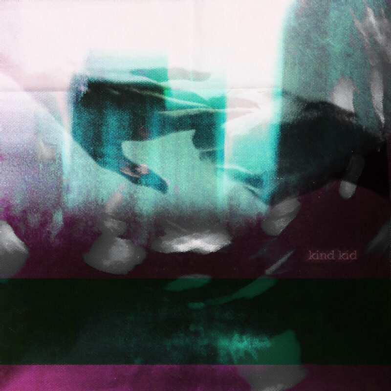
There is a special cruelty in being wounded by someone who has already left the room. The accusation lands, the door closes, and suddenly one person possesses the luxury of departure while the other inherits everything that remains unresolved. They replay every sentence, defend themselves to an empty room, and search for the words they were never allowed to speak. Kind Kid’s latest single bleed inhabits precisely that imbalance, turning abandonment into a bright, brisk synthpop song whose surface seems almost indecently cheerful beside the injury underneath.
The arrangement draws its movement from eighties synthpop and its darker hues from the gothic electronics of Clan of Xymox to the Modern Darkwave sensibilities of Boy Harsher, with eerie synth flourishes and cold, uneasy tones curling around a dark disco beat. The rhythm keeps the song moving toward the dance floor, though something in those keyboards suggests the argument will be waiting when you get home. Julien Martinez sings from the position of someone denied the final word, his sense of injury finding an accomplice in the music’s disquiet. That tension gives “bleed” its emotional force: the hooks offer release while the synths keep returning to the bruise.
The lyrics are deliberately circular. Images return, phrases repeat, and the speaker seems trapped inside an encounter that has ended everywhere except in his own mind. Repetition becomes psychological rather than decorative, suggesting those arguments one continues hours later while washing dishes, driving home, or staring at the ceiling, inventing increasingly perfect replies for someone who is no longer listening.
“I thought of it as some metaphorical situation where someone’s been left behind after some sort of attack… left to “bleed,” muses Kind Kid frontman Julien Martinez. “Sometimes a situation can feel so much different to one person than the other.”
One person may regard an argument as a momentary discharge of anger; the other can experience the same exchange as an injury requiring days to understand. bleed catches that disparity without weighing down its pop architecture. Its hooks remain airy, almost playful, while the words circle rejection, exposure, and helplessness.
Recorded at Golden Dice Studios in Brooklyn, the track was produced by Dutchrevz and Kind Kid, then mixed and mastered by Michele Ricci. bleed is Kind Kid’s final single before the album arrives October 9th.
Being understood by someone is a comfort until the relationship ends and their imagined opinion starts conducting an inspection of everything wrong with you. Boy Harsher’s Faulty inhabits that uncomfortable interval between asking to be wanted and wondering what that wanting has cost. Jae Matthews sings as though the verdict may already be in, while Augustus Muller gives her doubts enough room to move. The question of being better off alone becomes something to turn over on the dancefloor, where thinking clearly has always been optional.
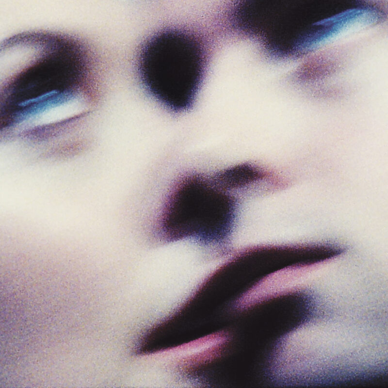
The song accompanies the release of Get Mean, out now following its September 18 arrival through Atlantic Records. Their first album since 2022’s The Runner, the twelve-track record follows the end of Matthews and Muller’s romantic relationship in early 2024, after a period of family loss, personal upheaval, and creative uncertainty. Continuing the band meant finding a way to work together while the terms of their lives were changing. That makes the tenderness of Faulty particularly affecting: the people making this music understand how complicated its questions can become.
A kicking beat, busy hi-hats, and quivering synths set Faulty in motion. Its dark disco rhythm has some of Careful’s physical insistence, softened by broad synth pads and little descending electronic notes that drop through the arrangement with a rounded, almost playful boop. When the beat pauses to breathe, the synths take on a Vangelis-like warble, briefly opening the song into something more spacious and cinematic. The rhythm returns beneath a lead synth that bends up and down in pitch, while Matthews keeps her voice hushed and close, breathing the words with a tenderness that borders on resignation.
The lyrics put affection and self-assessment in an uncomfortable room together. Asking whether she is faulty gives another person the power to diagnose her; asking whether she will come into her own begins to take some of that power back. Repetition keeps either possibility from becoming a settled conclusion. Matthews sounds caught between wanting to be held and recognizing how much of herself might be waiting outside the relationship.
Directed by Boy Harsher and shot on 35mm with cinematography by Owen Smith-Clark, the final video in the Get Mean series returns to a room lined in brown wood paneling. A television glows blue on a black stand, a small fan sits by the window, and a microphone cable trails across the carpet. Against that ordinary setting, the changing cast look dressed for entirely different evenings: a white cowboy hat, metallic bodysuits, striped knitwear, black boots. Each person seems to have brought a private version of the same bad night.
The camera moves from fixed views of the room into close-ups of faces, hands, and bodies moving past one another. People share the frame, lean together, or briefly touch, but proximity never quite settles the question in the chorus. There is a lovely awkwardness to it: the self-consciousness of dancing at home, followed by the sudden absorption of forgetting you are being watched. By the end, the people have gone and the television is still there. The room has held all that feeling without offering anyone an answer.
Watch the video for Faulty below:
Across Get Mean, the effort to keep going takes several musical forms. Writing began to move again when Matthews took to the road, travelling through West Texas, the Pacific Northwest, and South Florida. The album was eventually recorded in eight locations across the United States, Mexico, and Italy, its unsettled circumstances allowing new sounds and approaches into the duo’s work. Matthews describes it as “what I had to give during the most extreme period of my life.” The three singles we covered ahead of its release made clear how much that offering could contain.
The first indication came with Jeans, released in June. Its springy guitar figure and bubbling electronics brought a new wave directness to Boy Harsher, with a steel-slide twang giving the song a western accent. Our earlier comparison to the Pretenders still fits the way Matthews’ cool delivery rides that guitar, while the buoyancy also suggests Muller’s work in Safe Mind. Beneath the cheek is a sharp little study of ambition: the dream of escaping a small town, the dream of becoming somebody, and the possibility of ending up selling an image of freedom by the pair. The band’s latex line-dancing video, conceived with Robert Palmer’s Addicted to Love in mind, makes that collision between aspiration, performance, and merchandise deliciously literal.
Hard Beat, unveiled alongside July’s album announcement, tightens the pressure around a repeating bass-synth figure and an unrelenting kick. As we noted then, there is something of Depeche Mode’s Behind the Wheel in its meeting of motion, desire, and surrendered control. Matthews moves between confession and invitation while the rhythm keeps pushing ahead. Its video makes those exchanges physical through an elaborate leg brace, a Cadillac, and a handheld camcorder, drawing medical hardware, automotive controls, and the invasive act of filming into the same uneasy visual language. Within the album, the track preserves the severe club momentum that has long served Boy Harsher so well, giving the softer and more openly melodic songs something solid to push against.
August’s Tough Luck (When You Don’t Call) puts a warmer arrangement around the indignity of waiting for someone to remember you exist. A brisk new wave beat, rounded bass, bright keyboards, and short bursts of distorted guitar carry Matthews’ unhappy drawl toward the sort of pop chorus that can make despair briefly feel sociable. Her insistence that she is okay sounds increasingly like something she needs to practice. Our earlier review followed that idea into the lyric video, where yellow karaoke lettering crosses the blue screen of a CRT television. Created with vintage video equipment by Sean McGuirk and shot by Jesse Korman, it turns failed communication into a singalong with nobody else visibly present. Heard beside Faulty, the song makes the eventual question of solitude feel earned.
Coming Home opens with Matthews in a smoky, Lynchian register, her voice suspended over steadily repeating synths and a breezy dance beat. The low guitar tones bring New Order to mind, with the melodic weight of a Peter Hook bassline translated onto guitar. That combination gives the song an appealing pull between bodily ease and emotional uncertainty. The rhythm leaves the windows open; the vocal suggests someone still deciding whether it is safe to come inside. Here, the album’s broader musical interests allow vulnerability to sound inviting without making it seem simple.
Ice Pick (Walk Away) makes a particularly satisfying turn toward gothic rock. The parenthetical invites a Sisters of Mercy comparison before the guitar has even had its say, and the melody strengthens the association with their First and Last and Always period. A deep post-punk bass groove and the crunchy splash of the drum machine give the track a familiar dry ice chill. Matthews’ tender delivery moderates that severity, placing a vulnerable voice inside an arrangement with its collar firmly turned up. The resemblance is a pleasure to hear, especially from a duo whose love of this music has often been expressed through a different set of instruments.
Pray 4 Me lets the bass loosen its hips. Soft synth pads, a sexy funk groove, and quivering bell tones bring a strain of Bryan Ferry-eque sophisti-pop into the album, expanding its capacity for pleasure as well as distress. There is a suppleness to the arrangement that makes this feel like a natural extension of the record’s emotional dynamic range. Desire, after all, does not become less complicated when somebody gives it a particularly good bassline. Boy Harsher sounds comfortable letting elegance and appetite share the same song.
The album closes with Bleed, setting trip-hop beats against crystalline synths and low, bone-marrow-churning bass. Imagine the Bristol-born genre taking shape inside the electric dreams of the mid-1980s: the drums with a twitching hi-hat and thump have that low, unhurried weight, while the electronics give the space around them a cool, glassy clarity. After the movement of the preceding songs, this slower finish lets the record exhale. Its change of pace offers a place to sit with everything that has happened.
Get Mean gives Matthews and Muller’s affection for post-punk, synthpop, goth, and dance music considerably more room to misbehave. They have grown as people, their lives have changed, and their music has had the good sense to evolve. Those expecting Pain on an endless loop, or Careful with a fresh set of track titles, may find this development inconvenient. For listeners who share Jae and Gus’s musical curiosity, there is pleasure in hearing them loosen up, follow their enthusiasms, and discover what this new chapter of their partnership can become. And if Get Mean isn’t the Boy Harsher you ordered, well, tough shit.
Listen to Get Mean below and order the album here. Additional listening and purchase options are available here.
Since forming in 2014, Matthews and Muller have taken Boy Harsher from the small cassette run of Lesser Man, whose Pain spread widely online, through Yr Body Is Nothing in 2016, the Country Girl EP in 2017, and Careful in 2019. Their background in film became central to 2022’s The Runner, which they wrote, produced, directed, and scored. Their work in cinema also includes The Lonely Woman, their debut feature as directors, starring Chloë Sevigny, FKA twigs, and Sturgill Simpson.
Boy Harsher’s The Heartbreak Tour resumes September 25 at Basilica Hudson, with North American dates running through November 5 at New York’s Knockdown Center. The European and UK run begins November 14 in Lyon and includes London’s Roundhouse on November 29. Choir Boy joins select dates.
Technical death metal architects REVOCATION are pleased to present their video for Data Corpse. The track comes off the band’s acclaimed New Gods, New Masters full-length, released last year via Metal Blade Records. Comments vocalist/guitarist Dave Davidson, “Data Corpse is about social media companies constantly scouring our personal lives for profit. We unwittingly give up […]
Reigning in hell, screaming like a storm, MIDNIGHT’s obscenely intense aural display of lust, filth, and sleaze ripped the Los Angeles faithful a new one at two sold-out shows on May 28-29, 2026. As part of MIDNIGHT‘s Satanic Royalty 15th Anniversary World Tour, the incendiary gigs at Hollywood venue Knucklehead were recorded in all their […]
 Jamma is a Derby-based nu-metal band built on instinct, energy, and real-time creation. Formed through spontaneous jam sessions, the band focuses on capturing moments as they happen — turning noise into structure and emotion into sound. Blending heavy riffs, groove-driven rhythms, and emotionally charged delivery, Jamma exists between chaos and control. Theirmusic is not driven […]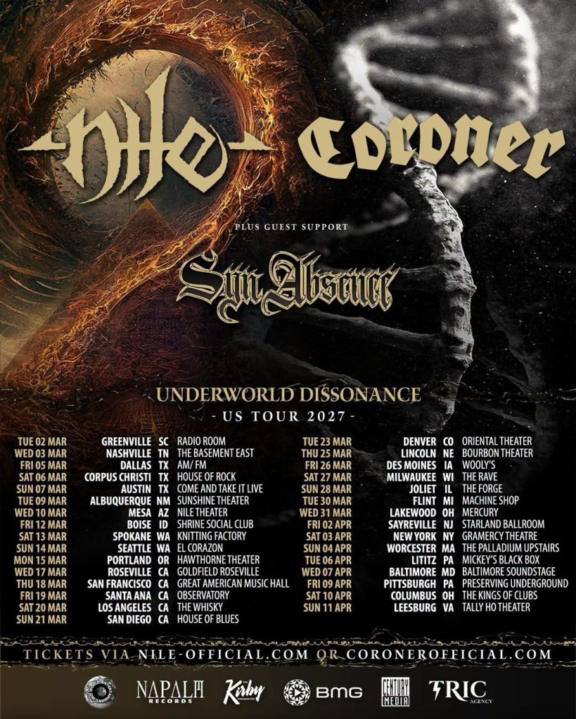



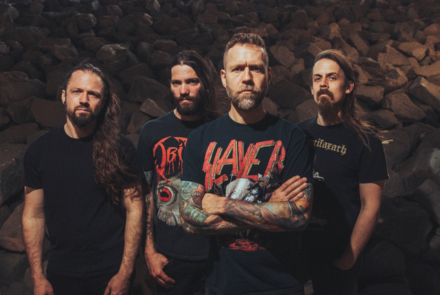 Technical death metal architects REVOCATION are pleased to present their video for Data Corpse. The track comes off the band’s acclaimed New Gods, New Masters full-length, released last year via Metal Blade Records. Comments vocalist/guitarist Dave Davidson, “Data Corpse is about social media companies constantly scouring our personal lives for profit. We unwittingly give up […]
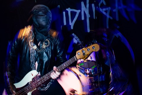 Reigning in hell, screaming like a storm, MIDNIGHT’s obscenely intense aural display of lust, filth, and sleaze ripped the Los Angeles faithful a new one at two sold-out shows on May 28-29, 2026. As part of MIDNIGHT‘s Satanic Royalty 15th Anniversary World Tour, the incendiary gigs at Hollywood venue Knucklehead were recorded in all their […]