TMZ tracked him down in Los Angeles after his reported firing.
The post Sid Wilson Brushes Off Question Over His Slipknot Status After Being Spotted Outside A Los Angeles, CA Studio appeared first on Theprp.com.
TMZ tracked him down in Los Angeles after his reported firing.
The post Sid Wilson Brushes Off Question Over His Slipknot Status After Being Spotted Outside A Los Angeles, CA Studio appeared first on Theprp.com.
The internet has been particularly generous to us this week, with a healthy number of rare and previously unseen live performances making their way online. From old TV shows to awards ceremony highlights to contemporary livestreams, here are 13 remarkable highlights, with a disclaimer: be quick, because at least a couple of these clips might not remain online for long.

In February 1964, at the height of Beatlemania, the Beatles played a sold-out show at the Coliseum in Washington, DC. The 12-song set was filmed by CBS and broadcast the following month, and has subsequently appeared on DVD. This latest (unofficial) clip of three songs upscales the video to 4K, colourises the footage and remixes the sound, and it shows the “lovable mop-tops” in complete control as carnage unfolds.
Famously, this is the night the band were pelted with jellybeans after professing a love for the popular sweet in an interview. “We were on a circular stage, so they hit us from all sides,” said George Harrison. “Imagine waves of rock-hard little bullets raining down on you from the sky. It’s a bit dangerous, you know, ’cause if a jellybean, travelling about 50 miles an hour through the air, hits you in the eye, you’re finished. You’re blind, aren’t you?”
Jimi Hendrix‘s shows at London’s iconic Royal Albert Hall in February 1969 were both captured by an American company, McCann Filming, and released as a concert movie later that year. This hour-long compilation uses the best available video and audio sources from the second of the shows (from February 24) and features some rare and previously unseen footage of Jimi backstage and after the show, an interview at Jimi’s London flat, and two acoustic covers filmed at the same location.
Last week we made some noise about a known-but-previously unreleased version of Black Sabbath’s N.I.B. filmed for the German TV show Beat-Club in 1970, and now here’s something from the following year as Krautrock lynchpins Can perform an eight-minute version of the classic Halleluhwah. This performance is a full ten minutes shorter than the studio version on Can’s Tago Mago album (thanks to standard television programming being unable to accommodate a 20-minute avant-garde jam), but Jaki Liebezeit’s relentless drumming and Damo Suzuki’s stream-of-consciousness vocals are still a treat.
Another 1971 gem from the Beat-Club archive as Family mix three different kinds of rock (progressive, blues rock and jazz) into something truly adventurous, with Roger Chapman improvising on vocals and a stellar rhythm section in the shape of bassist John Wetton and drummer Poli Palmer, who, presumably via some kind of post-production video magic, also appears on vibes. Palmer was filling in on the stool for regular sticksman Rob Townsend, who’d been bitten by his dog.
Since launching its archive on YouTube in early 2023, The Midnight Special has uploaded hundreds of clips and dozens of full shows, thus adding to the total sum of international enjoyment by a significant factor. This footage comes from the summer of 1975, when Uriah Heep were promoting their Return to Fantasy album, and features Mick Box & Co. (including our old friend John Wetton, who’d replaced Gary Thain earlier that year) playing the title track. This mix isn’t the best (too much bass, not enough guitar), and singer David Byron may be what they call “worse for wear”, but it’s undeniably full-on.
Thin Lizzy‘s Sight And Sound In Concert was filmed at the Regal Theatre in Hitchin in early 1983 and featured the band’s Thunder And Lightning lineup, with the late John Sykes fitting in beautifully alongside Scott Gorham on guitar. This footage of The Sun Goes Down finds Phil Lynott at his most melancholic, and has found its way to Thin Lizzy’s official YouTube channel in the footsteps of two other songs from the same show, Cold Sweat and Jailbreak.
Three Of A Perfect Pair might not be the best 80s-era King Crimson album, but the band were still absolutely monstrous live, as evidenced by this 1984 clip, which was filmed on the final night of a three-performance residency at the Kani Hoken Hall in Tokyo, and features some utterly heroic bass playing from the great Tony Levin.
This is the latest in a long line of songs released from the show (elsewhere you’ll find Discipline, Frame By Frame, Sartori In Tangier, Elephant Talk, etc, etc), which was filmed for Nippon TV and later issued on LaserDisc as Three of a Perfect Pair – Live in Japan.
Such is the celestial splendour of Pink Floyd’s Great Gig In The Sky, it’s easy to forget that this performance – filmed in Venice in 1989 – only took place after three months of bickering with the local authorities, led to the resignation of the town’s mayor, and took place on a barge. Backing vocalists Rachel Fury, Durga McBroom and Lorelei McBroom sing Clare Torry’s original freeform part brilliantly, much to the presumed delight of the estimated 100 million people who watched Pink Floyd in Venice: A Concert for Europe when it was broadcast worldwide.
In the last few weeks, Floyd have also released Shine On You Crazy Diamond, Time, Learning To Fly, The Dogs Of War, On The Turning Away, Yet Another Movie, Sorrow and Round And Round from the Venice show.
It’s easy to forget the cultural dominance of Chris Evans’s show TFI Friday, but for a while, back in the late 1990s, it was the UK show to appear on, with everyone from Bon Jovi to Slipknot, Tina Turner and Prince appearing live (and it was very live). The show’s official YouTube channel was launched earlier this year (more than 300 clips have already been uploaded), and the latest batch includes a pair of David Bowie performances, China Girl and Rebel, Rebel, from a broadcast in October 1999. Eagle-eyed viewers will note the presence of Helmet‘s Page Hamilton on guitar.
Back in 2011, Neil Young inducted Tom Waits into the Rock And Roll Hall Of Fame. “I didn’t bring my teleprompter or my notes, and I don’t have any real thoughts,” Young joked. ‘I will say that this next man is indescribable and I’m here to describe him.”
After doing so, the pair went on to perform Waits’ Get Behind the Mule, from his 1999 album Mule Variations. Waits has only played one significant show in the years since, when he completed a 10-song setlist at a Bridge School Benefit show in 2013. Quite why the Rock Hall have waited until now to release this clip is anyone’s guess, but we’re not complaining.
If there’s a more sublime combination of band and venue than Tedeschi Trucks Band and Denver’s Red Rocks Amphitheatre, then it surely must be in heaven. This twenty-minute teaser (you can skip five minutes of audience preamble) was filmed late last month and opens with a pair of rapturous Sly Stone covers in You Can Make It If You Try and Everyday People, plus their own Don’t Let Me Slide and the beginnings of Crazy Cryin’, before the footage fades. If you want to watch the whole thing, it’s available via TTB’s deal with streaming platform Nugs.
Filmed on the same night as Tedeschi Trucks’ Red Rocks show, but across the country at Grant Park in Chicago, this clip features Smashing Pumpkins’ entire Lollapalooza 2026 set, which includes a host of classics (1979, Bullet With Butterfly Wings, Disarm, Tonight Tonight, Cherub Rock and more) plus a trio of cameos from Yungblud, Olivia Rodrigo and Melissa Auf der Maur. It seems as if Billy Corgan (dressed here as Nosferatu, it would seem) is enjoying himself these days, and that comes across in a set that’s sonically spectacular and ultimately triumphant.
It’s been 22 years since the last Dark Funeral live album but the Swedish satanists are doing it again with A Beast to Praise, their second live LP. Due out August 21 on Century Media, A Beast to Praise immortalizes Dark Funeral’s first performance back from the Covid-19 pandemic. Recorded at Fållan in their hometown of Stockholm, it’s the end of an era and the start of something new for Dark Funeral.
Decibel spoke with founding guitarist Lord Ahriman about A Beast to Praise and what’s next for the band.
For us, it’s quite natural because we’ve always been a live band, so to save our live shows for fans to rediscover time by time, and also to give fans who are never going to watch us live a chance to experience us. For us, it’s quite normal to do studio records, do live records in between, even though this is just our second one. We wanted to do this for a long time.
We didn’t think about it in those terms. Whenever we have a show professionally recorded and if it sounds good, we try to do a live record with it, [especially] a show with a great setlist, spanning the whole catalog more or less. I think all of us think that this show was special in many ways, since it was the first show after the pandemic. It’s just a great setlist and a great atmosphere. To be able to put it out on a live record, it means a lot for many reasons.
The response I get on the setlist so far, people are like “Fucking awesome setlist.” Of course we can’t put all the classics on a live record, but everybody has been like, “Fuck, man, the setlist is killer.” I think it’s going to be a great release beore the next studio record.
That’s one of the reasons too. Closing the chapter—I always feel like in between every record a lot and I come to a point where we’ve been touring for three or four years, it’s time to move on. For me, it’s always been very important to just find this place, a good place where I feel like “OK, this is the end of this touring cycle and album cycle, chapter is closed but we need to do something to close the chapter.”
This time, it’s releasing a great live record and we’re doing a final support tour with Behemoth and Dimmu Borgir this fall. After this tour, it’s bye bye to old stuff and we’re looking into the future, full focus on the next studio record.
The only thing was, “Did this really happen? Did it really happen?” It did, I know it did. Now you look back and it’s been a couple of years, it feels kind of unrealistic that we went through all that bullshit.
I guess maybe to keep my psyche well, I try not to think about the time. On the other hand, the pandemic for us as a band came at a very good time. We had been touring. That was also like the closure for the album before.
The plan was, when we got back from vacation, we were going to start writing a new record. Some of us, especially me, got stuck abroad because some of the flights got canceled, so it took a while to get home. We couldn’t really do much. I was like, “Perfect! I can just focus on writing new music!” That was We Are the Apocalypse, which came from the pandemic.
In that sense, the timing was good, even though I would have preferred for the pandemic not to happen. I was stuck in Mexico a couple of weeks and it was a weird situation.
I’m kind of old school and I like to watch old live DVDs and stuff like that. Nowadays, you can find a lot of old concerts on Youtube too, so my original idea was to do a DVD with the live record. Long story, it didn’t turn out the way I was hoping. It’s going to be a couple of live videos, at least, not a full DVD.
Yeah, because we worked with professional video and film team. We had professional sound engineers to record. When you do that, you want to do the best outcome. It turned out really good, so I’m happy we decided to record it.
All the songs, all the time, they’re all kind of in a live environment. Some of the songs have some new twists and takes that are not on the actual studio record, but that’s why we’re not doing too many special effects in the studio and such. We try to keep it as simple as possible so we can do it as closely as possible live on stage. That’s always been a philosophy ever since the first EP. We wanted really good production but not adding too much extra stuff that we can’t pull off live.
Me and Heljarmadr have been working. I can’t remember when we started but it might be two years. We’re in the end of the writing process. I’ve been working today. I had my bassist, Adra-Melek, there. We went through the songs and me and Heljarmadr have been tweaking some vocal arrangements on the last song for the record.
We’re almost there. Not really there but the music is more or less finished. For this record, from the beginning, we kept it open, which is good, because the songs keep on growing once you enter the studio. This time, I kept it a little more open than I usually do and see where the songs take off.
I’m really excited. It feels fresh. It feels Dark Funeral, lots of surprises. It’s probably the most varied record I’ve written so far. It feels like it touches all the different worlds I like with music—evil, speed, fucking aggressive, intensity into the darkest melancholy, deep black hole. There’s a wide span of feelings into the songs this time.
That’s the tricky part when I started writing this record. I had ideas for what I wanted to improve from previous records. When I finish one record in a studio, I always have ideas where I want to move the next time, but this time I felt like I really need to step up the game bringing new ideas into the music, mainly for myself. I want to feel inspired, which makes me more creative. It feels great.
Do you think working on the live record, going back to older stuff, has that influenced you at all when writing new music?
I never try to look back or re-listen to older records because I want to be here and now in the present. If I get stuck—what I’ve done in the past, it’s done. I’m really happy with the back catalog but why would I try to go back and copy myself? That wouldn’t make any sense to me, so I’d rather not listen to older stuff and try to be in the present and see where it takes me. For me, that’s very important when I want to write songs.
It’s what’s happening now. What’s going on in my head, what brings me inspiration at this time. That’s what I want to bring out in the music. I don’t want to copy myself, but of course I have my way of writing. Of course, you’re going to get lots of classical me riffing Dark Funeral melodies and stuff.
I don’t know why, but for this record it felt more important than ever. I wanted to refresh myself a little bit more than before. This time, I really was struggling in what direction I wanted to bring in new stuff into the songs to make it interesting for me. It’s been going well. I was so used to doubting myself in the beginning, but when everything starts coming together, like I told Heljarmadr the other day, I think we fucking did it again.
That’s why it’s got to start with yourself. If you’re satisfied and happy with it, then whatever comes after that, you can’t control.
I think the show in itself, the setlist, it’s just a great live album. The show has newer stuff, older, slower, fast. It’s a great mix of different Dark Funeral music and as I said before, we’ve always been a live band. For us, it’s important to pull off the studio version as well as possible on stage too.
The post Interview: Dark Funeral Guitarist Lord Ahriman on New Live Album, ‘A Beast to Praise’ appeared first on Decibel Magazine.
The ‘Breakout: Hibernation Of The Nations Tour’ to be exact.
The post Megadeth, Black Label Society & Testament Announce 2027 European/UK Tour appeared first on Theprp.com.
In a new interview with Oran O’Beirne of Overdrive.ie (transcribed by Blabbermouth), Sepultura frontman Derrick Green spoke about his plans for after the band’s ongoing farewell tour. He said: “Well, I still wanna be involved in music. I would definitely love to create another band. And so I’m working on that, putting people together, getting together with people and seeing how that goes.”
Asked about a possible musical direction for his post-Sepultura project, Green said: “What I’m feeling is I definitely would love it to be as heavy, but at the same time a lot more melodical, a bigger mixture of singing and screaming. That’s the vibe that I’m feeling. And very much groove oriented. It’s what I have in my head.
“But it all depends on the combination of people that come together to create this idea. But I’ve already started talking to people and trying to figure out what could work best.
“’Cause I’m very excited with the music scene that’s happening. I live in [Los Angeles], so there’s a lot of bands passing through, and I had the chance to check out a lot of things that I never knew about or bands I’d never heard about.
“And it’s an exciting time, especially for hardcore and me being a hardcore kid, growing up in that scene, it’s great to see how it’s expanded and how big it’s become and still having so many different bands with their own personality and that stick out and are just super impressive and very energetic, and such a diverse scene of people. It’s great to see that mixture, because it wasn’t always there.”
Green also addressed the non-music pursuits he plans to explore once the farewell run concludes: “I always felt that I wanted to do voiceover work, whether it be for animation or commercial work, so that’s something that I’m gonna be pushing for, 100%.
“And also with food and the plant-based world, definitely working as far as whatever cool ideas that come about. I love to be a part of any type of project, and it’s great working with [former Whitesnake and current Bruce Dickinson bassist] Tanya O’Callaghan. Hopefully we can do more with [the plant-based travel and lifestyle web/TV series] ‘Highway To Health’, was the name of our program that we have. We have a lot of material that was never shown. It still needs to be edited. So hopefully we’ll be able to do more with that.
“So there’s a lot of options at the end of this. And so just trying to put it together in my head, but at the same time, stay focused with the many shows that we have in front of us.”
Sepultura’s final show will take place on November 7, 2026, at the Mercado Livre Arena Pacaembu in São Paulo, Brazil. Also on the bill: Metal Allegiance, featuring Mike Portnoy (Dream Theater), Alex Skolnick and Chuck Billy (Testament), Phil Demmel (ex-Machine Head), Troy Sanders (Mastodon) and bassist-founder Mark Menghi; Krisiun; and Sacred Reich. Former members including Jean Dolabella and founding guitarist Jairo Guedz — who preceded Kisser in the lineup — are also expected to appear.
Sepultura most recently released the EP The Cloud Of Unknowing via Nuclear Blast and is recording 40 songs in 40 different cities for a live album commemorating the farewell run. The tour launched on March 1, 2024 at Arena Hall in Belo Horizonte, Brazil — marking the debut of drummer Greyson Nekrutman (ex-Suicidal Tendencies), who stepped in after Eloy Casagrande departed to join Slipknot.
The post DERRICK GREEN On Post-SEPULTURA Plans: “I Would Definitely Love to Create Another Band. I’ve Already Started Talking to People” appeared first on Sonic Perspectives.
For our second annual all-British issue, we have assembled 11 of the UK’s most exciting rising stars for a special group photoshoot and interview, this time at the legendary Camden Barfly venue.
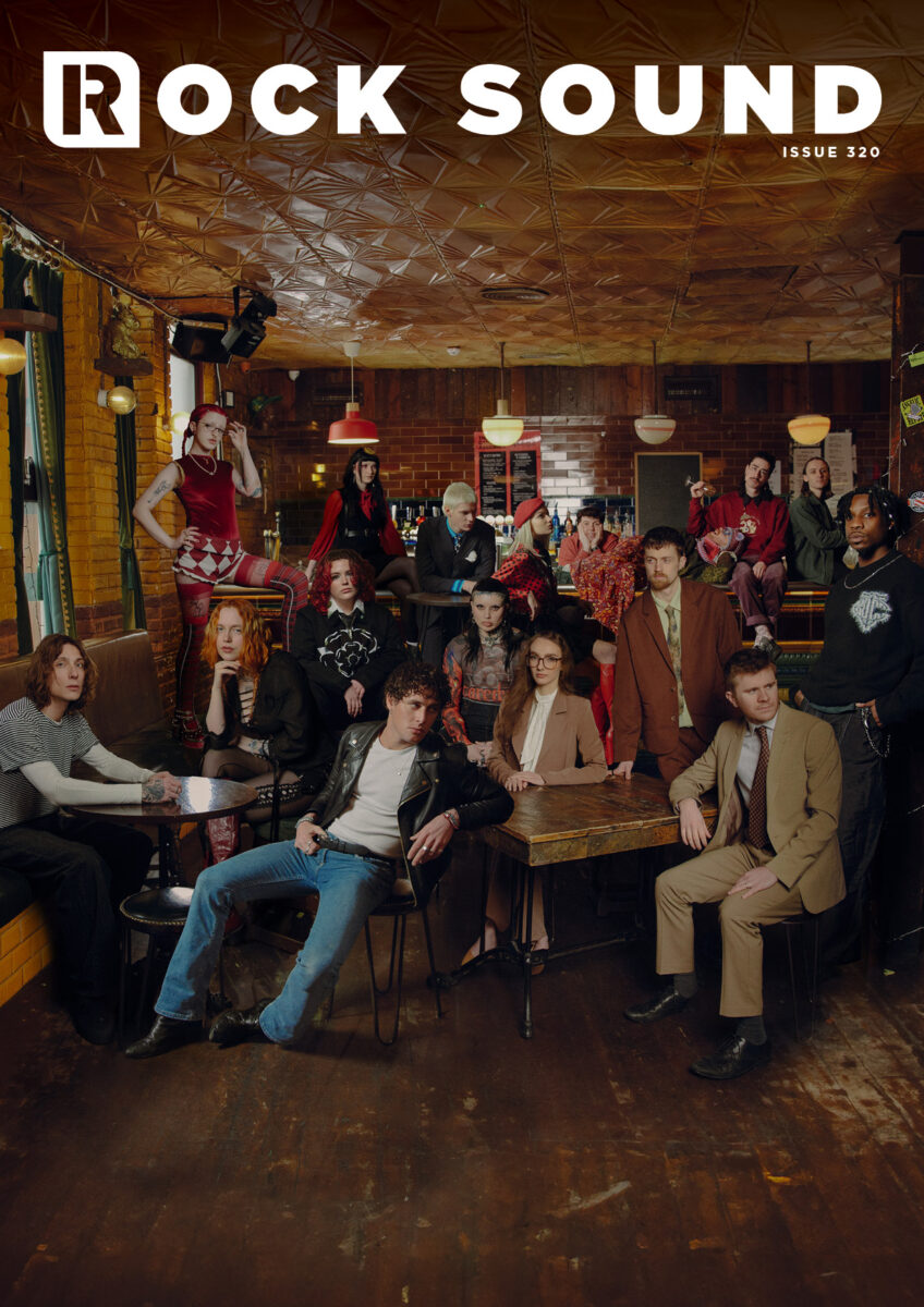
It’s time for you to get to know…
THE MOLOTOVS
NATIVE JAMES
AS EVERYTHING UNFOLDS
BEARS IN TREES
ZAND
MOUTH CULTURE
WITCH FEVER
ARTIO
CODY FROST
LEAP
EXPLORING BIRDSONG
…as we celebrate the best of new British alternative music.
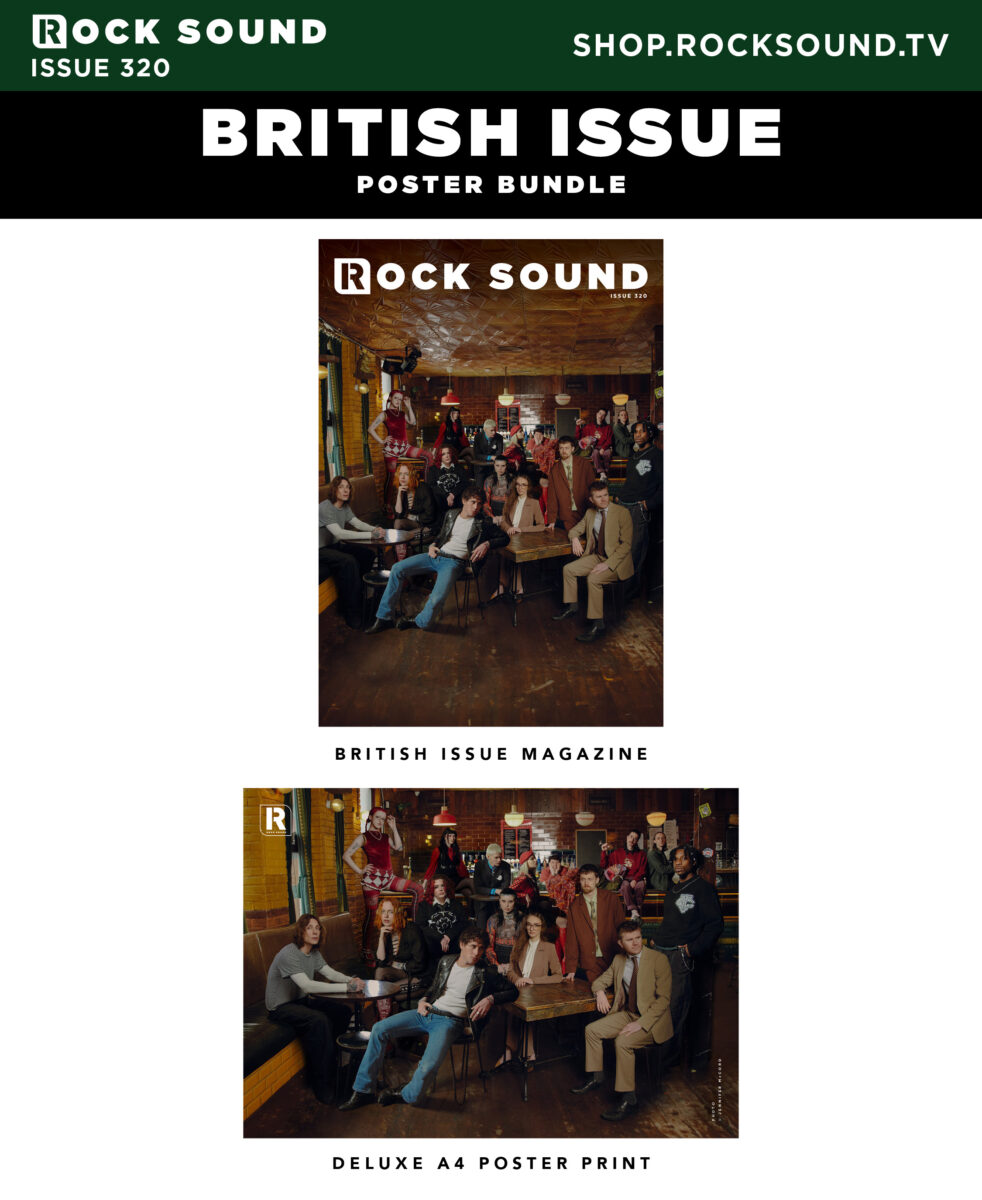
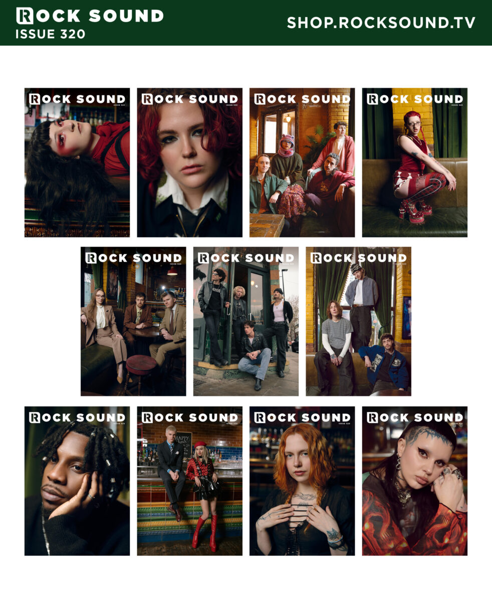
Plus, each of these ten artists also has their own limited edition magazine cover variant.
Get yours alongside an A4 group poster print, only at SHOP.ROCKSOUND.TV
The post Rock Sound’s ‘British Summer’ – Group Magazine Cover appeared first on Rock Sound.

Liebe Metalheads,
wie angekündigt könnt ihr seit heute, 03. August 2026, 18.00 Uhr euer übrig gebliebenes Cashless Payment Guthaben über unser Eventportal zur Auszahlung anfordern. Das Guthaben wird innerhalb von 14 Tagen nach Beantragung gutgeschrieben.
Euer
W:O:A Team
Der Beitrag Cashless Payment 2026 – Rückerstattung des Restguthabens erschien zuerst auf Live, laut, legendär!.
A page opens beneath candlelight. Dense black letters fill the parchment, their sharp angles rising like cathedral spires. At first glance, the text appears beautiful. A second look reveals something more unsettling. The letters seem almost architectural, crowded together like stone towers casting long shadows across the page.
Few visual styles possess the enduring power of Gothic typography. For more than eight centuries, Blackletter fonts have been associated with mystery, authority, religion, horror, and the darker corners of imagination. They appear on medieval manuscripts, heavy metal albums, Gothic novels, tattoos, and modern digital artwork. Despite dramatic changes in technology and design, their emotional impact remains remarkably consistent.
The reason goes beyond nostalgia. Gothic typography communicates ideas before a reader processes a single word. Its dense forms, sharp lines, and dramatic contrasts create an atmosphere that feels ancient, serious, and slightly unsettling. The letters themselves become part of the story.
This is why Gothic typography has survived long after many historical design styles disappeared. It transforms language into architecture, turning ordinary text into a visual experience shaped by beauty, mystery, and shadow.

The story of Gothic typography begins in medieval Europe. During the twelfth century, scribes working in monasteries and religious centers developed increasingly compact styles of writing. Parchment was expensive, and manuscripts required enormous amounts of labor. Dense letterforms allowed more text to fit onto a page while maintaining legibility.
Over time, these writing styles evolved into what modern designers call Blackletter. The letters became narrow, angular, and vertically oriented. Curves were reduced. Straight lines dominated. The resulting appearance felt structured and monumental.
Far from being purely decorative, the style reflected the visual culture of the era. Gothic cathedrals were rising across Europe, filling city skylines with pointed arches, stained glass, and soaring vertical forms. Typography absorbed many of the same aesthetic principles.
Letters no longer resembled casual handwriting. They resembled architecture.
The invention of movable type transformed Gothic typography from a regional manuscript tradition into a dominant visual language. When Johannes Gutenberg printed his famous Bible in the 1450s, he chose a Blackletter style closely resembling the handwritten manuscripts readers already trusted.
This decision was practical, but it also carried symbolic importance. The printed page preserved the authority and gravitas associated with religious texts. Readers encountered a new technology through a familiar visual form.
As printing spread across Europe, Blackletter became one of the most recognizable typographic styles in the world. For centuries, it represented knowledge, tradition, and institutional power.
Yet the same qualities that communicated authority also created an atmosphere of mystery. The dense arrangement of letters, heavy use of black ink, and elaborate forms gave Gothic typography a visual weight that simpler typefaces could not replicate.
Most people recognize Gothic typography instantly, even if they cannot identify specific fonts such as Textura or Fraktur. The emotional response occurs almost automatically. The letters appear dramatic, historical, and slightly ominous.
Part of this reaction comes from density. Gothic typefaces place letters close together, creating dark blocks of text rather than open fields of white space. The page feels heavier. Shadows seem to accumulate between characters.
Verticality also plays an important role. Many Blackletter fonts emphasize upward movement through tall strokes and pointed forms. The effect resembles Gothic cathedrals reaching toward the sky. Readers unconsciously associate these shapes with age, grandeur, and spiritual intensity.
Even the sharp angles contribute to the atmosphere. Rounded forms often appear friendly and approachable. Angular forms suggest tension, precision, and seriousness. Gothic typography uses these visual cues to create emotional impact before the text itself has been read.
The darkness is not contained within the words. It emerges from the letters themselves.
Typography influences perception long before readers consciously process language. Designers understand that shapes carry emotional associations. Rounded forms often appear welcoming. Geometric forms suggest efficiency. Handwritten scripts can feel personal or elegant.
Gothic typography operates according to a different set of visual signals. Its compressed structures, pointed angles, and dense arrangements create an immediate impression of seriousness and complexity. The letters seem to belong to another era.
This reaction occurs partly because Blackletter differs dramatically from the clean, open typefaces that dominate modern life. Most people spend their days reading sans-serif fonts on screens, signs, and digital interfaces. When confronted with Gothic typography, they encounter something visually unfamiliar.
The unfamiliar naturally attracts attention. It slows reading and encourages closer examination. The text feels less like information and more like an artifact.
Psychologists often describe the uncanny as the sensation of encountering something that feels both familiar and strange at the same time. Gothic typography frequently produces this effect.
Readers recognize the letters as part of the alphabet, yet the forms appear transformed. Words remain readable, but their visual presentation feels distant from ordinary experience. The page occupies an unusual space between communication and ornament.
This tension contributes significantly to Gothic typography’s enduring appeal. The letters belong to the modern world while simultaneously appearing to emerge from a forgotten past. They feel alive with history.
A Gothic page often resembles a relic rather than a simple document.
For centuries, Blackletter appeared in religious texts, legal documents, royal decrees, and scholarly publications. Readers repeatedly encountered the style in contexts associated with power and knowledge. Over time, the visual language absorbed those associations.
Even today, Gothic typography often communicates authority before a single sentence has been read. The style feels formal, ceremonial, and important. Designers continue using it when they want to suggest tradition, heritage, or historical significance.
This authority stems partly from complexity. Blackletter requires more effort to read than many modern fonts. The visual density encourages concentration. Readers instinctively slow down and pay attention.
The result is a typeface that feels substantial. It demands engagement rather than passive consumption.
Authority alone does not explain Gothic typography’s connection to horror, dark fantasy, and Gothic culture. Another factor is mystery.
The visual density of Blackletter creates subtle ambiguity. Individual letters sometimes appear interconnected. Shadows form between strokes. Decorative details reward careful observation. The page reveals itself gradually rather than immediately.
This mirrors many of the themes found within Gothic literature itself. Secrets remain hidden. Meanings unfold slowly. The reader moves through uncertainty toward understanding.
Typography becomes part of the narrative atmosphere. Before the story begins, the visual presentation has already established expectations.
Although Edgar Allan Poe rarely discussed typography directly, publishers quickly recognized that Gothic letterforms complemented the atmosphere of his work. Across generations, editions of Poe’s stories and poems have frequently employed Blackletter titles, ornate Victorian layouts, and dark decorative elements.
The connection feels natural. Poe’s fiction explores hidden fears, psychological uncertainty, decaying spaces, and the tension between beauty and death. Gothic typography communicates many of these ideas visually before readers encounter the first paragraph.
A modern edition of The Raven printed in a minimalist sans-serif font creates one impression. The same title presented in dramatic Gothic lettering creates another entirely. The words remain unchanged, yet the emotional experience shifts immediately.
Typography functions as a threshold between the reader and the text. Gothic letterforms prepare the imagination for mystery.
The most successful book design does more than package content. It extends the themes of the work itself. Gothic typography excels at this because its visual qualities align naturally with many Gothic narratives.
Consider a typical Gothic novel. Ancient architecture, hidden histories, family secrets, and psychological tension frequently appear throughout the story. Blackletter evokes many of these ideas through shape alone. The letters seem weathered by time. They suggest forgotten archives and candlelit libraries.
Readers may not consciously analyze these visual cues, yet they influence interpretation nonetheless. The typography becomes part of the storytelling process.
Long before a haunted house appears on the page, the atmosphere has already begun forming in the reader’s mind.
Gothic typography survived centuries of technological change because it continually adapted to new cultural movements. While many historical typefaces remained confined to museums and archives, Blackletter found new audiences in music, fashion, literature, and visual art.
During the twentieth century, the style became closely associated with alternative culture. Heavy metal bands adopted Gothic lettering for album covers, logos, and merchandise. Horror publishers used it to create atmosphere before readers opened a book. Fantasy artists employed Blackletter to suggest ancient kingdoms, forgotten histories, and supernatural worlds.
The appeal remained remarkably consistent. Gothic typography communicated seriousness, mystery, and emotional intensity. It transformed ordinary titles into visual statements.
Whether appearing on a medieval manuscript or a modern album cover, the letters continued performing the same essential function. They made language feel larger than everyday life.
Few visual styles have influenced dark culture as profoundly as Blackletter. Horror films frequently employ Gothic typography in posters, title sequences, and promotional artwork because the style immediately establishes mood.
Musicians discovered the same advantage. Gothic rock, black metal, dark folk, and numerous alternative genres embraced Gothic lettering as a visual extension of their artistic identity. The typography became part of the atmosphere surrounding the music.
A simple title rendered in Gothic lettering feels different from the same words presented in a modern corporate font. One suggests mystery and history. The other suggests efficiency and clarity.
The emotional difference is immediate.
The arrival of computers transformed nearly every aspect of typography. Designers gained access to thousands of fonts while digital interfaces encouraged cleaner, more minimalist approaches to communication.
Many observers assumed highly decorative styles would gradually disappear. Gothic typography proved surprisingly resilient.
One reason is contrast. As digital design became increasingly streamlined, Blackletter became even more visually distinctive. Its complexity stood out against the simplicity of modern interfaces.
Another reason involves emotion. Minimalist fonts excel at delivering information efficiently. Gothic typography excels at creating atmosphere. The two styles serve different purposes.
Whenever designers want to evoke history, mystery, spirituality, horror, or dramatic intensity, Blackletter remains one of the most effective visual tools available.
The survival of Gothic typography reveals an important truth about design. People do not respond only to information. They respond to feeling.
A typeface can communicate emotional meaning before the reader consciously processes language. Gothic lettering demonstrates this principle with unusual clarity. The forms themselves generate atmosphere.
This ability explains why the style continues appearing across media that have little direct connection to medieval Europe. Modern audiences may know nothing about monastic manuscripts or Gothic cathedrals, yet they still recognize the emotional language encoded within the letters.
The visual vocabulary remains surprisingly universal.
After more than eight centuries, Gothic typography continues captivating readers because it accomplishes something rare. It transforms writing into an experience.
The dense black forms evoke history. The vertical structures suggest architecture. The sharp angles create tension. Together, these elements produce a visual language capable of communicating mystery before a single word has been read.
Few design traditions maintain such emotional power across radically different eras. Blackletter has survived manuscripts, printing presses, industrialization, photography, cinema, and the digital revolution. Through every transformation, it retained its ability to command attention.
The reason is simple. Gothic typography speaks to something deeper than fashion. It appeals to humanity’s fascination with history, symbolism, and the unknown.
Readers encounter more than letters on a page.
They encounter atmosphere.
From medieval monasteries and Gutenberg’s printing press to Edgar Allan Poe editions and contemporary Gothic culture, Blackletter has remained one of the most recognizable visual styles ever created.
Its endurance comes from more than tradition. Gothic typography transforms language into architecture. Every page becomes a space readers enter rather than simply observe.
The letters rise like cathedral spires. Shadows gather between strokes. Meaning unfolds through both text and design.
That combination of beauty, mystery, and visual drama explains why Gothic typography continues inspiring artists, writers, musicians, and readers around the world.
The words tell the story.
The letters create the mood.
If Gothic literature, Edgar Allan Poe, dark aesthetics, and the visual language of mystery inspire you, explore the Edgar Allan Poets store. Discover apparel and artwork created for lovers of darkness, imagination, and timeless Gothic culture.

Continue your journey through Gothic culture, dark aesthetics, and literary mystery with the official Edgar Allan Poets playlist.
Gothic typography, often called Blackletter, is a style of writing and type design that emerged in medieval Europe and is characterized by dense, angular, highly decorative letterforms.
Its visual density, historical associations, and dramatic appearance naturally complement themes of mystery, darkness, history, and atmosphere found within Gothic culture.
Poe did not specifically write in Gothic typefaces, but publishers have frequently used Blackletter and Victorian-inspired typography for editions of his works because the style complements their themes.
Dense letter spacing, strong vertical structures, sharp angles, and heavy black forms create visual weight and psychological associations with mystery, history, and seriousness.
Yes. Blackletter remains popular in music, fashion, publishing, gaming, branding, and alternative culture because of its powerful visual identity.
The post Black Ink and Dark Pages: The Visual History of Gothic Typography appeared first on Edgar Allan Poets – Noir Rock Band.
(written by Islander) As you can see, the cover art created by Brvja XIII for Demonic Manifestation’s new album Grimshrine is a cornucopia of horrors. It seizes attention and maintains it as the viewer more carefully inspects each of its hideous visions. The album is also a musical cornucopia of horrors that turns out to […]
The post AN NCS PREMIERE: DEMONIC MANIFESTATION — “HOST” appeared first on NO CLEAN SINGING.